
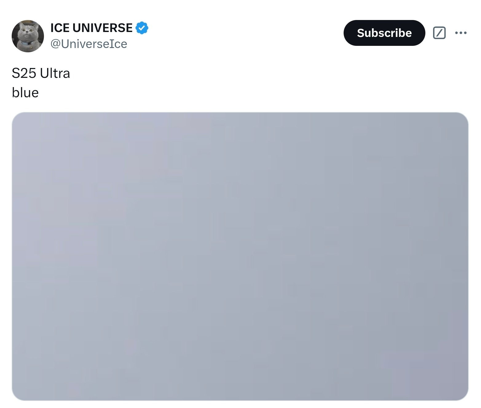
Phone makers stick to safe colors, black, white and muted shades are the norm. But Samsung’s S25 Ultra is going to bring a new “blue” color that’s so subtle, it’s almost grey. According to a reliable source, this unusual choice has tech enthusiasts scratching their heads.
The “Blue” That Looks Grey
Ice Universe just shared details about the S25 Ultra’s new color. Marketed as “blue” this one is more grey than blue with a hint of blue. How subtle is that? It’s one of the most boring color options ever on a phone.
While Samsung has offered pastel and soft colors before, especially through its online store, this “blue” takes minimalism to a whole new level. Is Samsung taking cues from other brands’ understated designs?
Subtle Colors in Phone Design
Samsung’s ultra subtle blue isn’t new. Other tech companies have done subtle colors too, blending pastels or muted tones into their product lines.
Google’s Playful Approach
Google is a great example of this trend, especially with its Pixel phones. Over the years it has introduced creative names and colors that are subtle. For example:
*The Pixel 3 had a “Not Pink” option that was barely pink.
*The Pixel 3a had “Purple-ish” a muted lavender color.
*The Pixel 8 and 9 Pro had “Hazel” a gray with a hint of green.
These were unique and subtle, for users who wanted something different but not too bold. Samsung’s S25 Ultra seems to be taking it to the next level by having a color that’s almost indistinguishable from gray.
How the Galaxy S25 Ultra’s “Blue” Compares
If the image is real, the Galaxy S25 Ultra’s blue is making Google’s pastels look bold. This subtle design will appeal to a small crowd that likes minimalism and sophistication. But it will also alienate those who want bolder colors.
Samsung is following a trend in smartphone design where manufacturers are moving away from loud, bright colors and towards more refined, more muted tones. Some will see this as a step up in design. Others will see it as too boring or even dull.
The Bigger Picture for Smartphone Design
Color choices in smartphones are more than just about looks; it’s about consumer trends and branding. For Samsung, the blue of the Galaxy S25 Ultra means a more professional, more subtle image for their flagships.
But this also means, what about creativity and diversity in smartphone design? Are manufacturers playing it too safe? Should brands cater more to users who want bold, attention grabbing designs?
Final Thoughts
The blue of the Galaxy S25 Ultra is Samsung’s most subtle bold move yet, elegance with a pinch of uncertainty. Not everyone will love it, but this will start some interesting conversations about smartphone design.
As Samsung continues to push their flagships, we’ll see how this blue will be received by consumers. Will it be seen as a bold step towards subtlety or too safe? Only time will tell.
1 Comment
[…] Come Early In 2025 OnePlus Open 2 Design Leaked, Expected To Launch In Early 2025 Samsung Galaxy S25 Ultra New Blue Color Leaked iPhone 17 Pro To Feature A Smaller Dynamic […]